Last week I posted some images I rendered in SolidWorks to create some unique business cards. The idea was pretty simple. Moo.com let’s you have as many different images for the backs of your card as you like. I thought it would be fun to generate up some 3D text describing the type of work I do here at Zalaco, and render that image with different colors/materials to add some variety to my stack of business cards.
This first order was a bit of an experiment to see how the screen images translated to print (I’m not a graphic artist by any stretch, so my knowledge is thin here). I also decided to go ahead and create a rendered image for the front text of the card, but wasn’t really expecting much from that.
3D Rendered Business Card Backs
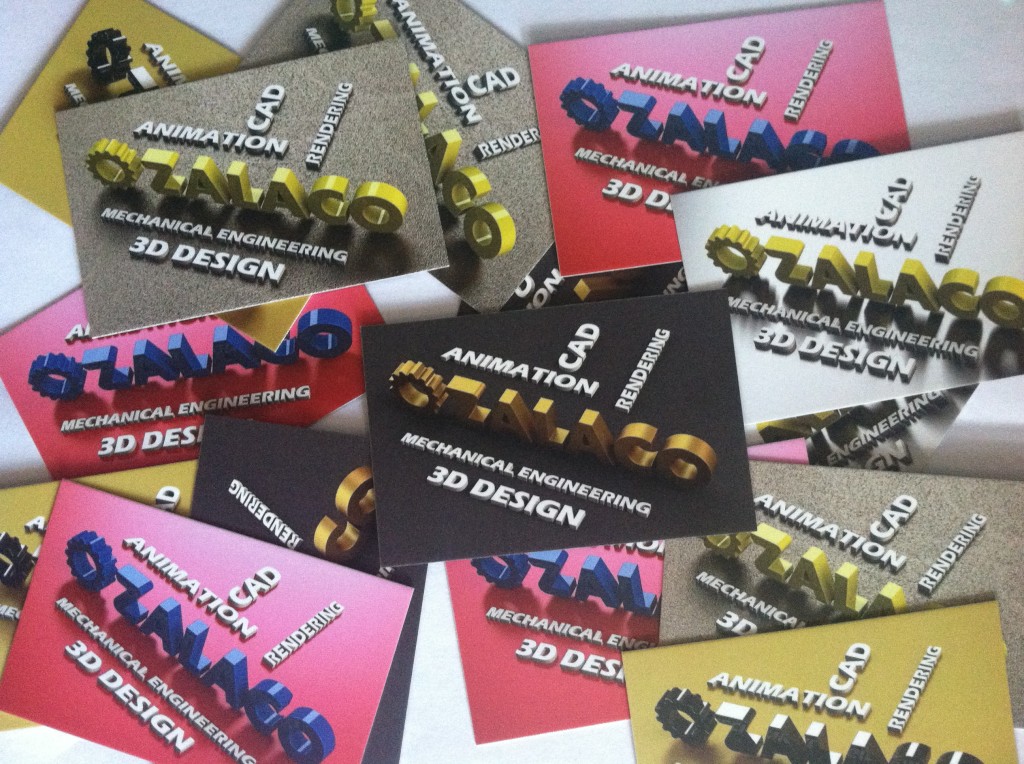
Overall, the images came out really well. Here’s a bunch of the cards scattered about showing all five different rear designs:

3D Rendered Business Cards
Here’s how I rank the color combos seeing them in person:
- Black Background, Matte Gold Logo: My personal favorite is in the center. This one suits my taste best and has a very clean and professional look in person.
- Reflective Metal Backgroun, Low Gloss/Satin Yellow Plastic Logo: This one has a good 3D pop to it with the reflection on the metal background. Good overall look.
- Gold Background, Glossy Black Plastic Letters: Ok so this one didn’t turn out that great. The glossy black plastic is too filled with shadows. But I do like how the gold background looks. Had the logo been a matte silver/metal color, I think these would have been much better.
- Powdercoated Background, Yellow Plastic Logo: The powder coat is a cool effect, but I think it’s too busy for the cards. The shadow/reflection does look nice.
- Red Background, Blue Letters: I wanted to do one card that was brighter with some primary colors. This one looks good, just not to my taste.
3D Rendered Business Card Front
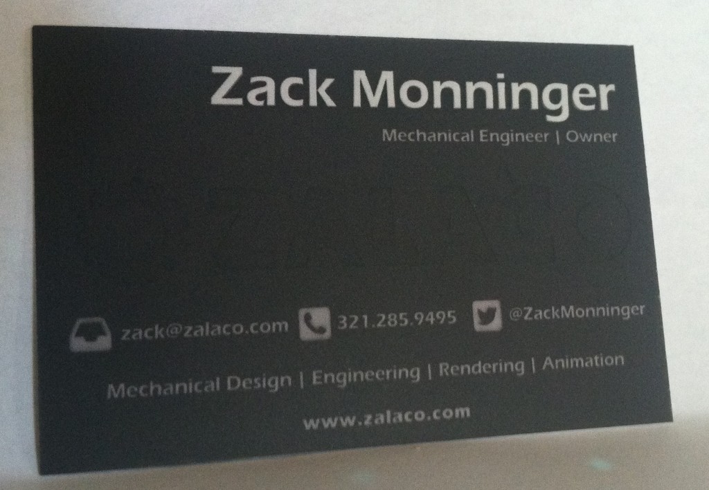
The front of the cards came out “OK”. I think a lighter background would have helped the Zalaco watermark show up better. The shadowing just blends in with the dark color. In direct light, the logo shows up nicely. Otherwise, you almost don’t see it at all. The text came out good enough.

Business Card Front
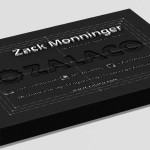
Below are pics of what the original rendered image looked like, as well as an iso shot of the model it came from.
- Rendered card front – dark powdercoated surface with engravede/embossed text.
- Here’s an ISO view of the model in Solidworks. Phantom lines show the design limits of the card.
Conclusion
The backs of the cards came out really well. Next time, I’ll probably get rid of overly textured backgrounds (like the powder coat), but maybe look for a little bit more reflection in the floors.
If you’d like some similar images for you business cards, feel free to get in touch.


